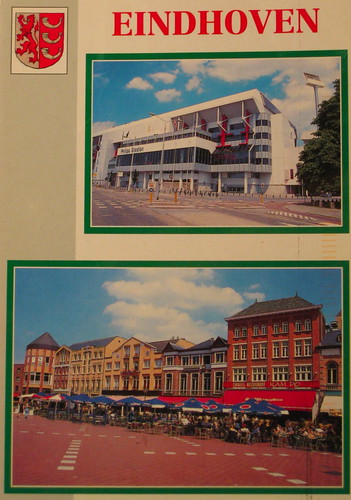
For some reason, I decided I should post a card I don't like. Normally I only post cards that, if I don't love, there is at least something interesting about it. Is it too negative to say why I don't like this card? First of all, it is a multiview, and neither picture is that attractive, plus the way they are put together isn't at all artistic. If it were even symmetrical or the color scheme were matched, I think it would look nicer. I have a number of other cards that I don't like for the same reasons... maybe some people really like this type of card? Otherwise I don't even know why a company would print it. I can't discount the possibility that in some towns there are no nicer cards, and of course I still appreciate the sender's effort to write a nice message and send me a card. She writes that the top is the soccer stadium of Eindhoven, and the bottom is the market square, where she likes to sit in the market square and have a drink in the summer. It does look like a good place for that. :)
According to wikipedia, Eindhoven is unique in the number of modern art pieces in parks and around the city, including this one:

And a google image search shows many attractive pictures of the city that would also make good postcards.
Maybe I should go into the postcard design business. Actually I did design one postcard myself, and had it printed through Vistaprint (mainly because there are no commercial postcards of Sogenji and I wanted one). It must be nice enough because a lot of people on Postcrossing have put it on their favorites wall.
OK, now I am getting off my soapbox.
I don't think there's anything wrong with occasionally posting a card you don't like ... it helps anyone who reads your blog before sending you a postcard to find something that you will like. Examples AND counterexamples are important pedagogical tools. (and now i'll get off my soapbox too :)
ReplyDeleteElizabeth