Showing posts with label dislike. Show all posts

Saturday, January 26, 2013

Gomel, Belarus

IMG_7755
Gomel

Blurry photo of an ugly building. Quite honestly, I don't know why someone would even produce a card like this, let alone purchase it. One of the things I have on my wishlist is the sender's favorite place in their country, and the sender of this card states that they chose this one because they like Gomel very much. I am sure they do, but I am still mystified why they would choose this ugly card to represent a place that has a number of nice places.

However, the sender did write me a nice message and used lots of stamps. :)

The green ones are a 2012 definitive from the series on architectural monuments, this particular one being Niasvizh Castle, a UNESCO site in the city of Niasvizh. The purple one in the middle is from the same set, this one showing the Kamianets-Podilskyi Castle  in the city of Kamianets-Podilskyi. The flower on the right is a lily from a 2008 set on garden flowers.

Wednesday, January 2, 2013

Plzeň, Czech Republic

Pilsen Beer

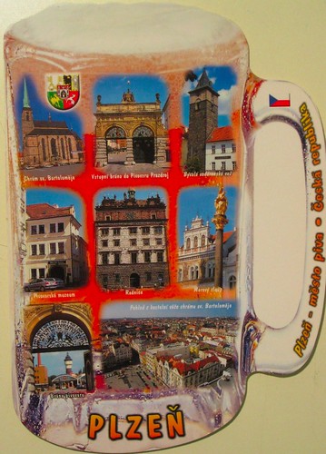
Plzeň, Czech Republic.

Plzeň is a town famous for its beer. It's an old town going back to the 11-12th century. Apparently the town celebrates its liberation by the U.S. army in 1945 each May, flying many American flags and displaying guns and tanks.

The card shows many sights of Plzeň including:
Church of St. Bartholomew
gateway to the Urquell brewery
former water tower
brewery museum
town hall
plague column
view from the Church of St. Bartholomew

 I don't think I would be particularly excited to visit this town, since I don't like beer...

Perhaps the coolest thing about this postcard is that it came with a stamp featuring the Plzeň water tower, issued in 2007.

Wednesday, December 12, 2012

Selfprinted Ad

IMG_7797

I was pretty disappointed when I got this card. It's a selfprinted one. The majority of the cards sent by this person are similar selfprinted ones. Either this or with a different graphic but mostly the same message. This time the reason I don't like the card isn't that it's ugly. It tells me absolutely nothing unique about the person who sent it or the place they live. It's basically an advertisement for postcrossing - but I already know about postcrossing! This would be a good card to give to people who ask you why you're buying so many postcards when you're not a tourist (this happens to me a lot!), if it explained how postcrossing works on the back. But I don't think this is a good card to send to someone who is already a postcrosser. (Of course I registered the card and thanked the sender even though I didn't like the card. I am glad they took the time to send me a card.)

I know many people disagree with me though, because a lot of postcrossers have put this card on their favorites wall. This is just my personal opinion. You are all welcome to voice yours in the comments. And if someone really likes this card and wants to swap for it I am happy to send it on to someone who will properly appreciate it. ;)

It seems like cards I don't like also usually come with boring stamps or none at all. This is a scrap of paper printed from the internet and pasted on the card.

Thursday, September 20, 2012

Kuşadasi, Turkey

IMG_1009
Kuşadasi

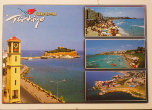
Kuşadasi is a resort town on the Aegean coast. The name comes from the words for "bird" and "head," because supposedly from overhead, the shape of the peninsula looks like the head of a bird. I have to say, I don't see it.

This is a good example of the type of card I don't like. In its defense, I did a google image search of Kuşadasi, and it seems these pictures are pretty much exactly what it really looks like. I'm sure I would enjoy having a nice relaxing day on the beach if I were really there... or checking out one of the water parks with white-water slides.

 This stamp is from a 2010 set of sixteen (!) entitled "Istanbul 2010 European Capital of Culture".

Friday, April 6, 2012

Canberra, Australia

IMG_6262
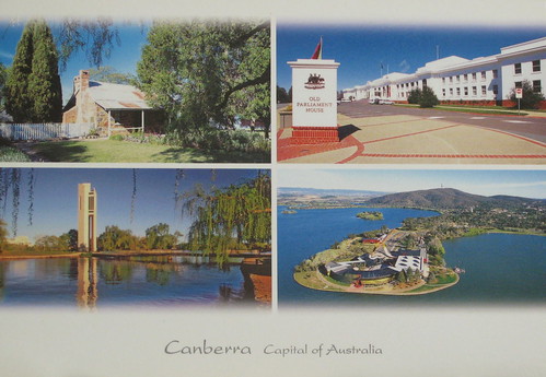
Canberra, Capital of Australia
1. Blundell's Cottage - 1858
2. Old Parliament House - 1927
3. National Carillion
4. National Museum of Australia

This card came as an official in an envelope with several other cards. This particular one I don't really care for, not because there's anything wrong with it per se, just because I'm not really a fan of multiviews. (Of the four views, the bottom left is most appealing to me.) The sender writes, "It is called the bush capital because we have retained a lot of natural bushland throughout the city."

Right now I'm reading In A Sunburned Country by Bill Bryson, a travel book about Australia. It took me a while to get into it (I started it on my trip to Asia in December), but now I am quite enjoying it. Bryson visited Canberra in his travels, and had this to say:

My one tip if you ever go to Canberra is don't leave your hotel without a good map, a compass, several days' provisions, and a cell phone with the number of a rescue service. I walked for two hours through green, pleasant, endlessly identical neighborhoods... from time to time I would come to a leafy rotary with spoked roads radiating off in various directions, each presenting an identical vista of antipodean suburban heaven, and I would venture down the one that looked most likely to take me to civilization only to emerge ten minutes later at another identical rotary. I never saw another soul on foot... Eventually, and abruptly, I turned a corner and was downtown. Here at last were stores and restaurants and all the other commercial amenities of a city, but all were closed.

Saturday, November 5, 2011

Česka Lipa, Czech Republic

IMG_3317

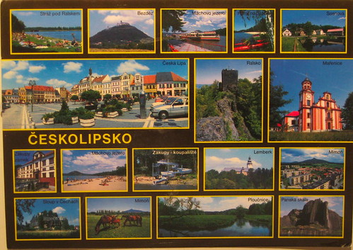
Here is another example of a card I dislike, and the perfect example of why I dislike multiviews. Even though most of the pictures are nice, you can't really see any of them! And, naturally, they decided to make one of the not-as-nice pictures the largest.

I can understand trying to convey all your region has to offer, but going this route you just detract from it. If they had chosen four or five even, and arranged them artistically, it could have been a much better card. Or they could just have picked one. If you do a google image search for the towns named on this card, you can see pictures of how nice they look, but big enough to actually see!

/Soapbox.

Monday, September 5, 2011

Eindhoven, Netherlands

Eindhoven

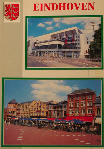
For some reason, I decided I should post a card I don't like. Normally I only post cards that, if I don't love, there is at least something interesting about it. Is it too negative to say why I don't like this card? First of all, it is a multiview, and neither picture is that attractive, plus the way they are put together isn't at all artistic. If it were even symmetrical or the color scheme were matched, I think it would look nicer. I have a number of other cards that I don't like for the same reasons... maybe some people really like this type of card? Otherwise I don't even know why a company would print it. I can't discount the possibility that in some towns there are no nicer cards, and of course I still appreciate the sender's effort to write a nice message and send me a card. She writes that the top is the soccer stadium of Eindhoven, and the bottom is the market square, where she likes to sit in the market square and have a drink in the summer. It does look like a good place for that. :)

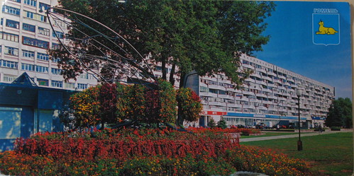
According to wikipedia, Eindhoven is unique in the number of modern art pieces in parks and around the city, including this one:

And a google image search shows many attractive pictures of the city that would also make good postcards.

Maybe I should go into the postcard design business. Actually I did design one postcard myself, and had it printed through Vistaprint (mainly because there are no commercial postcards of Sogenji and I wanted one). It must be nice enough because a lot of people on Postcrossing have put it on their favorites wall.

OK, now I am getting off my soapbox.