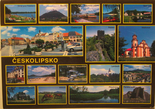
Here is another example of a card I dislike, and the perfect example of why I dislike multiviews. Even though most of the pictures are nice, you can't really see any of them! And, naturally, they decided to make one of the not-as-nice pictures the largest.
I can understand trying to convey all your region has to offer, but going this route you just detract from it. If they had chosen four or five even, and arranged them artistically, it could have been a much better card. Or they could just have picked one. If you do a google image search for the towns named on this card, you can see pictures of how nice they look, but big enough to actually see!
/Soapbox.
No comments:
Post a Comment